Overview
Knowing what and how your customers think and feel about their experience in your district is the first step in providing exceptional customer service. Your Let’s Talk! dashboard is a quick way to monitor and measure how well the district is doing. The dashboard metrics give you the critical data you need to make informed decisions to ensure your customers receive the best customer experience.
- System Admins & Global Users: Overview data is pulled from all Topics
- Team Members: Overview data is pulled from Topics in which you belong to
Cx Score
- Cx stands for Customer Experience
- The Cx Score (measured on a 10-point scale) is the average score calculated by adding all feedback scores received during the selected time period and dividing by the total number of scores received.
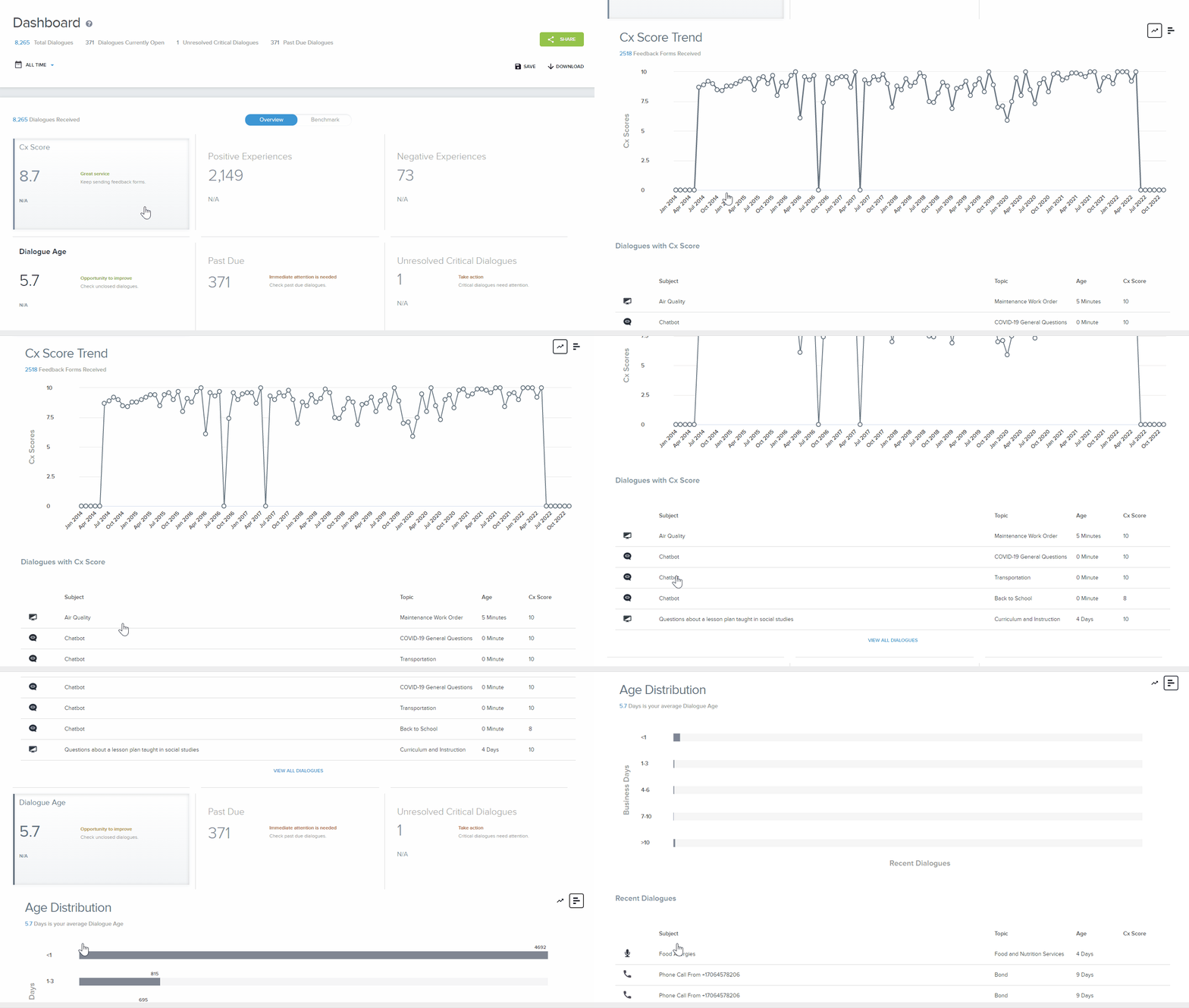
- Click on the Cx Scorecard to expand it for more details such as
- Average district Cx Score
- Number of feedback forms received
- Number of scored dialogues
- By default: A score trend over time graph is shown
- Toggle the icon on the right-hand corner of the scorecard to display the score distribution
- Recent dialogues with Cx Scores can be found at the bottom of the scorecard
- To collapse the card, click on the card again
- Change in Cx Score
- The average Cx Score difference between scores received based on the selected time period and the average Cx scores of the equivalent past time period
- For example, if today’s data were June 30 and you selected “Last 30 days,” the change in average score would be the difference between scores received between June 1 and June 30, and scores received between May 1 and May 31.
Dialogue Age
- The Dialogue Age number represents the average number of days it takes to close dialogues based on the hours of a business day.
- Your district can set Dialogue Age to display as an average number of hours or days.
- Your district can set the number of hours for a business day.
- Change in Dialogue Age
- The difference between the average number of days it took to close dialogues in a selected time period and the average number of days it took to close dialogues in the equivalent past time period
Past Due
- The Past Due number represents the total number of past due dialogues based on your district’s Past Due Definition setting. The Let’s Talk! default setting is five business days.
- Change in Past Due
- The Past Due difference represents the number of past due dialogues as of the last day of the time filter and the first day of time filter
- For example: If you select “Last 30 days,” the Past Due difference is the total number of past due dialogues on day 1 minus the total number of past due dialogues on day 30. The red triangle denotes more past due dialogues, while the green triangle denotes fewer past due dialogues.
Unresolved Critical Alerts
- The number of Unresolved Critical Alerts represents critical dialogues with a status of:
- Unopened: Dialogues that have not been addressed by the district
- Pending details: Dialogues that are waiting on information from the customer
- In progress: Dialogues that are ongoing and is being addressed by the district
- Change in Critical Alerts
- The difference between the number of Unresolved Critical Alerts (open, pending details, or in progress) on the first day of the time filter and last day of the time filter.
Positive Experiences
- Positive Experience dialogues received a Cx score (measured on a 10-point scale) of eight or higher. The total number of Positive Experience dialogues is based on the time period selected in the filter.
- Click on the scorecard to a word cloud of comments from positively scored interactions.
- Hover over each word to view the intensity (a scaled look at divisive topics), the sentiment (a feeling of negative to positive), and a count of the occurrences and dialogues that specific word appeared in feedback forms.
- Click the View Positive Dialogues button to see an inbox view of all dialogues that received positive CX scores.
- Change in Positive Experience dialogues
- The difference between the number of positive experience dialogues received on the first day of the time period and the last day of the time period selected using the filter
- A cut score of eight or higher was determined based on statistical analysis of all Let’s Talk! Cx scores received by all K12 Insight clients between January 2014 and January 2021. The average Cx score was 8.4.
Negative Experiences
- Negative Experience dialogues received a Cx score (measured on a 10-point scale) of five or lower. The total number of Negative Experience dialogues is based on the time period selected in the filter.
- Click on the scorecard to a word cloud of comments from negatively scored interactions.
- Click the View Negative Dialogues button to see an inbox view of all dialogues that received negative CX scores.
- Change in Negative Experience dialogues
- The difference between the number of negative experience dialogues on the first day of the time period and the last day of the time period selected using the filter
- The cut score of five or lower was determined based on statistical analysis of all Let’s Talk! Cx scores received by all K12 Insight clients between March 2014 and January 2018. The average Cx score was 8.10. Scores lower than six are one standard deviation below the average. Very positive scores are 9.0 or higher.
Open Dialogues
- The number of Open Dialogues includes all unopened, pending details and in progress dialogues.
- Change in Open Dialogues
- The number of open dialogues based on the difference between the first day of the time period and the last day of the time period as defined by the filter
Community Voice
Navigating the Word Cloud- Intensity
- Hover over each word to not only see their frequency count seen in dialogues, but also how big of a divisive topic this word might be with the intensity scale
- By looking at the examples above, while bus appears bigger because it is occuring more often, it has low intensity.
- Buses running late on the other hand, appears yellow because the intensity of this phrase brings more emotional data for district leaders to visibly see how their community feels.
Navigating the Word Cloud- Sentiment
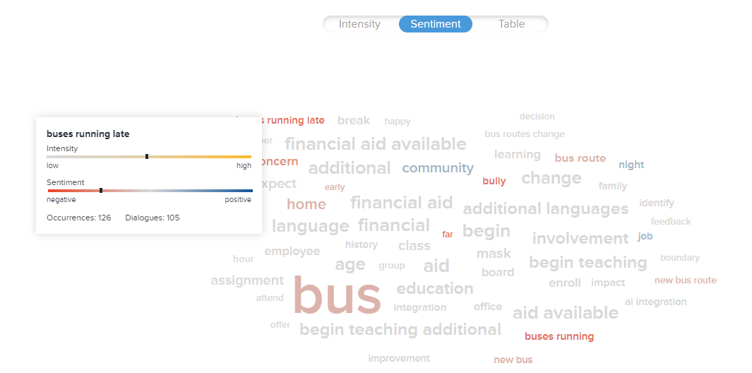
- Hover over each word to not only see their frequency count seen in dialogues, but also a way to closely look at trending words to identify if they are leaning towards a positive or negative sentiment.
- As seen in the earlier example, Buses running late, was identified with a rising intensity from the community. We can also see that because this statement is a prominent red color, this topic is trending towards a negative sentiment. Now we have actionable data to bring back to district leadership.
Navigating the Word Cloud- Frequency Table
- The Frequency chart lists the top frequently used words identified in the options (30, 60, or 90) in rank order during the time period selected in the filter.
- Customize the table by ranking alphabetically, number of occurrences, amount of dialogues, or by intensity and sentiment scores.
Navigating the Word Cloud- Options & Sharing
- Click on any word to open an inbox view of the dialogues containing those words
- Click on the blue Options menu for:
- Managing Filtered Words
- We have applied several filtering techniques to ensure meaningless words do not appear in your word cloud
- Add or customize a list of words you don’t want included in the word cloud
- Type your word in the textbox and click Add
- Click Save to apply changes
- Text Orientation
- Customize how you want your words in the word cloud to appear. Choose from Horizontal and Vertical, or Horizontal only.
- Click Save to apply changes
- Word Count
- Customize how many words you would like to appear in the word cloud. Choose from 30, 60, or 90.
- Share
- By clicking on the Table view, you will find the option to share a snapshot of your word cloud out via email
- You have the ability to attach a message to the email
- Managing Filtered Words
Dialogue Summaries
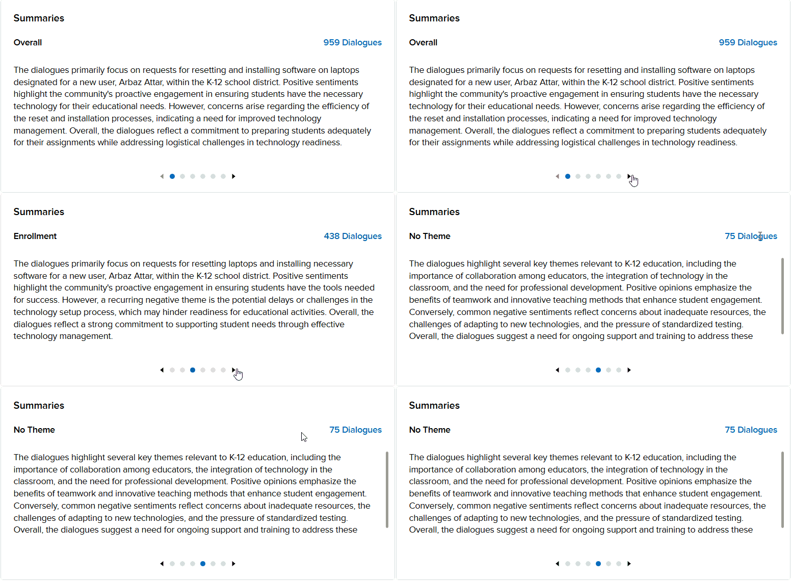
Let's Talk AI Generated themes for topics within your organization's account are based on data analyzed from dialogues and based on the time frame selected within the Dashboard. From these summaries you can derive insights to guide action plans based on the topics.
Trending Themes
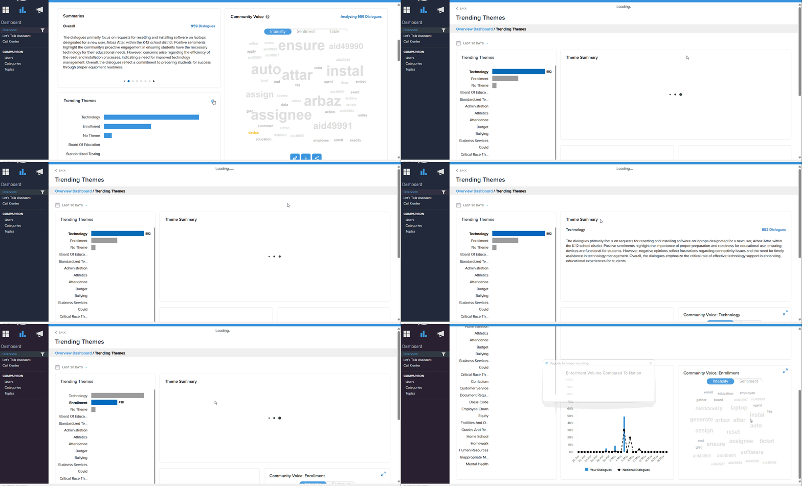
This section provides a more detailed breakdown of each topic within your district's account to identify areas of enhancement and compare your data to national benchmark data. Within this section you can find the following information:
Theme Summary
Each topic in this section provides the total number of dialogues as well as the summarized theme for each dialogue. These summaries incorporate positive sentiments that reflect achievements of Let's Talk users with customers and negative sentiments that highlight potential barriers to provide a comprehensive overview of the topic.
Community Voice by Topic
This focused version of the Community Voice feature words in the topic used most frequently within the topic selected. We also incorporate Sentiment and Intensity in the word clouds for these topics, as the central word cloud does for all dialogues.
Benchmark Data
The topic data compares the volume of dialogues in the topic for your district's dialogues to national dialogues.
Dialogue Metrics
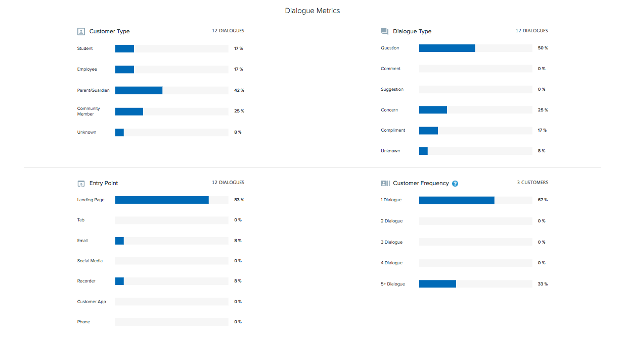
The dialogue metrics provide detailed information about the dialogues received during the time frame selected in the filter. The data and charts provide a snapshot of who submitted dialogues, what type of dialogue was submitted, how the dialogues were submitted, and the distribution of how many dialogues customers submitted.
Customer Type
- See your dialogues broken down into customer types by %
- Hover over the bars to get a deeper look
- Count of dialogues for each customer type
- Top 5 Topics that are receiving dialogues from these customer types
- Click on the bars to open an inbox view of the dialogues from that customer type
- Unknown customer type includes dialogues submitted or created from email, social media, and only anonymous dialogues submitted prior to July 7, 2017
- The percentages will not add up to 100% since a customer could select multiple roles.
Dialogue Type
- See your dialogues broken down into dialogue types
- Hover over the bars to get a deeper look
- Count of dialogues for each dialogue type
- Avg. Cx score for that dialogue type
- Top 5 Topics that are receiving dialogues from these dialogue types
- Click on the bars to open an inbox view of the dialogues from that dialogue type
- Unknown dialogue type includes dialogues submitted or created from email, social media, and anonymous dialogues.
Entry Point
- See your dialogues broken down into entry points
- Hover over the bars to get a deeper look
- Count of dialogues coming from each entry point
- Avg. Cx score for that entry point
- Top 5 Topics that are receiving dialogues from these entry points
- Hover over the Landing Page bar to get a deeper look
- Count of dialogues coming from Landing Pages
- Avg. Cx score for dialogues submitted from Landing Pages
- Top 5 Landing Pages that are receiving dialogues
- Hover over the Tabs bar to get a deeper look
- Count of dialogues coming from Tabs
- Avg. Cx score for dialogues submitted from Tabs
- Top 5 Tabs that are receiving dialogues
- Click on the bars to open an inbox view of the dialogue from that entry point
Customer Frequency
- Let’s Talk! tracks the number of times a customer’s email address or phone number is used and tracks IP addresses for anonymous dialogues. The customer frequency chart shows the percentage of customers who submitted.
- Disclaimer: The Customer Frequency graph includes anonymous customer dialogue data. Anonymous dialogue customer data is cataloged in Let’s Talk! using an IP address, therefore the data presented may not accurately represent individual customers.
Dialogue Activity
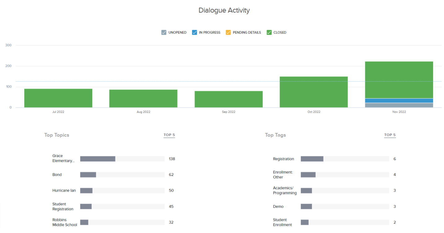
The Dialogue Activity vertical bar chart represents the day-to-day status of dialogue activities over the time frame selected in the dashboard filter. The blue horizontal dashed line represents the average number of dialogues received over the filtered time frame.
You can customize the Dialogue Activity graph view by including/excluding each status simply by clicking on each status on the Graph Legend.
Top Topics
The top five topics are listed in the horizontal bar chart in order of most frequent to least over the dashboard filtered time frame. This time frame is adjustable by the user such as last 30 days, last 90 days, or a custom time frame.
Top Tags
Dialogues can be tagged with categories found in the Tag List. Tagging is optional. The horizontal bar chart shows the top five tag categories. A minimum of 10% of all dialogues must be tagged for any category to show.
Downloading and Sharing Report
The dashboard report can be shared or downloaded for you to disseminate information to colleagues for analysis and decision making.
Share Report
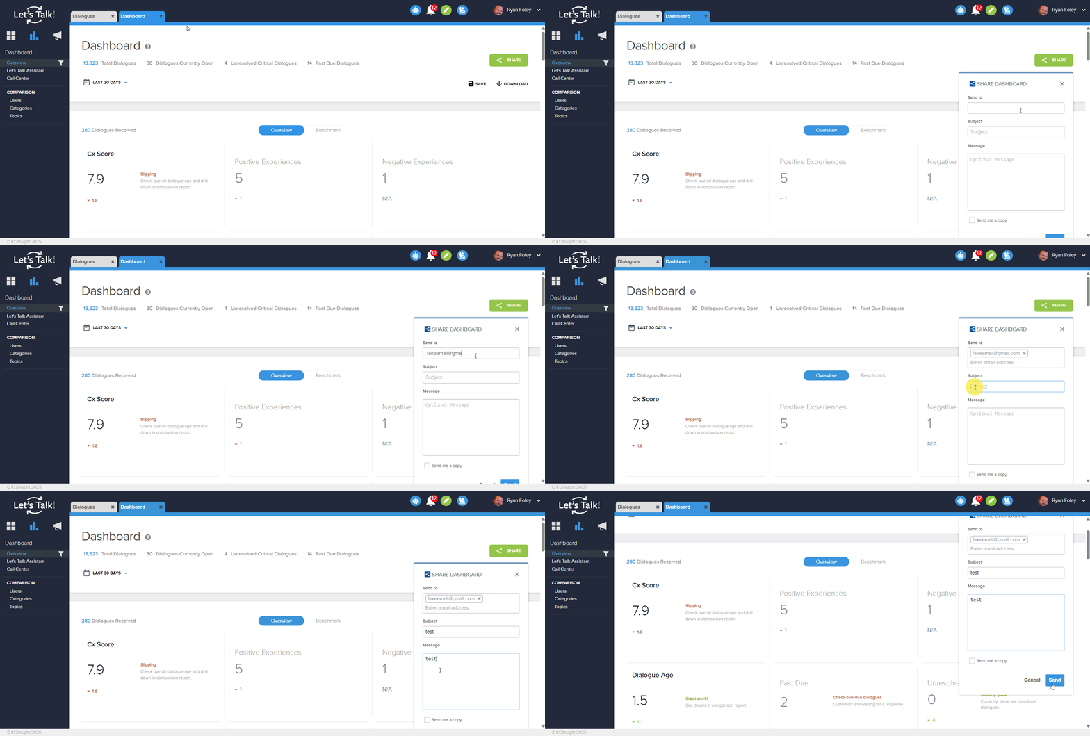
- Click Share
- Type in Email of recipient of report
- Optional: Fill in Subject, Message, and click 'Send me a copy' checkbox
- Click Send
Download Report
- Click Download
- Select the information you want included in the report
- Select the Report Format (PDF or PowerPoint)
- Click Download
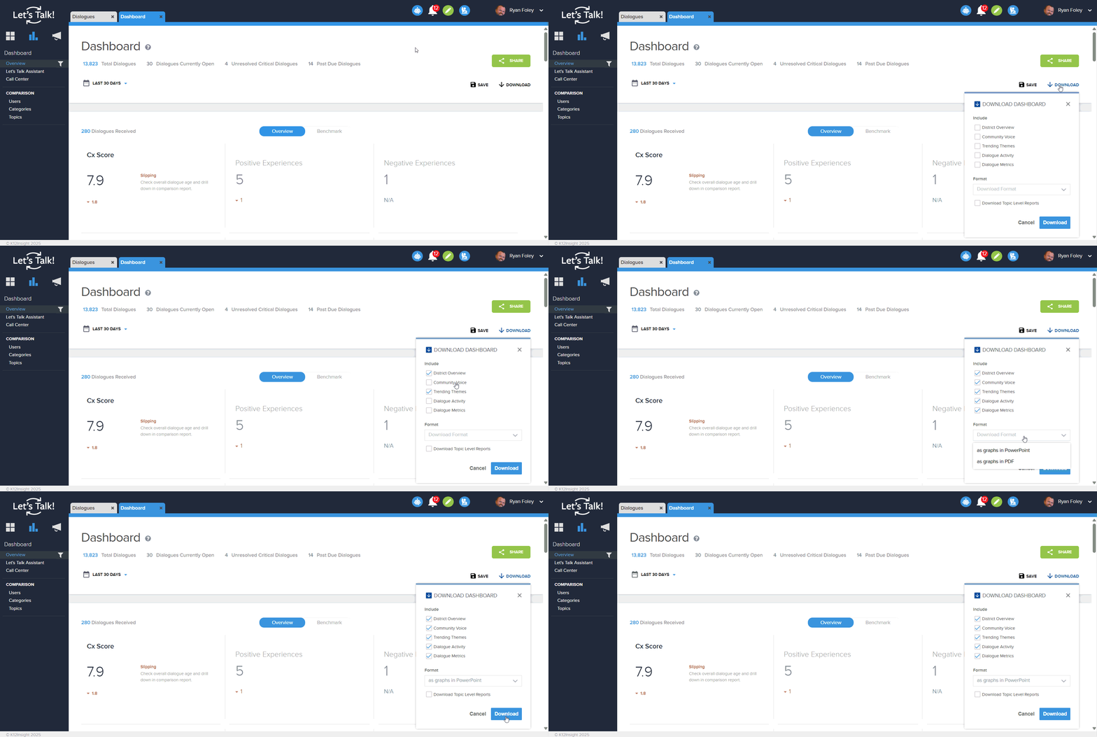
Note: The PowerPoint format will include top themes and AI-generated summaries

